
Discovery
We mapped where people stalled and which parts of the experience felt densest or hardest to read.
- Homepage review
- Content analysis
- Navigation issues
- User behavior
Project Overview
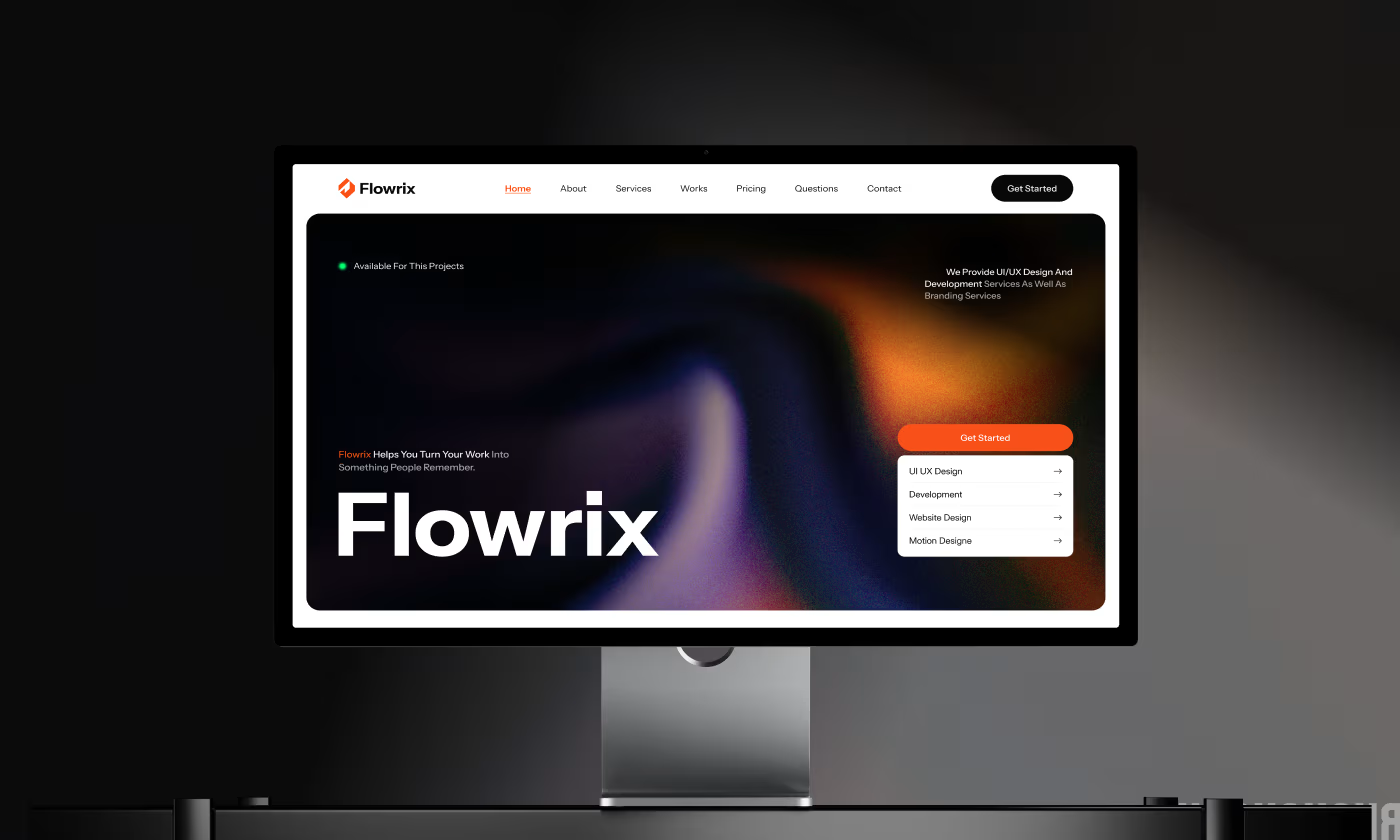
The project focused on transforming a dense, overwhelming web experience into a clear, guided interface that makes financial management feel effortless.

Our objective was to redesign the Flowrix website to eliminate user confusion. We needed to restructure how financial information and product features were presented, ensuring visitors could instantly understand the product's value and take action without feeling overwhelmed.
Problem
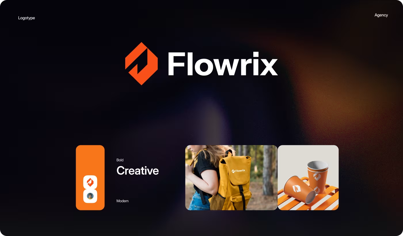
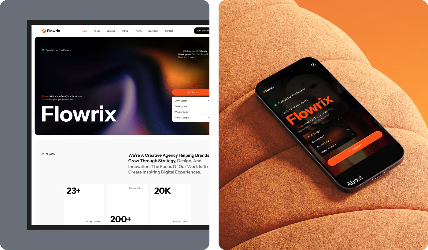
The core challenge was cutting through the overwhelm—so people could explore the platform and grasp its financial features without getting lost.
Solution
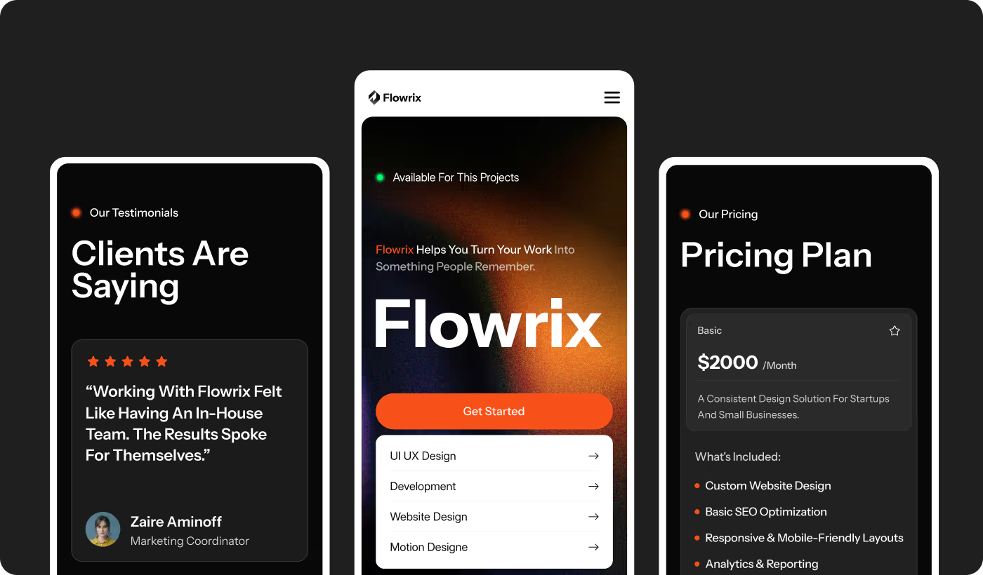
We redesigned the site to simplify financial information, sharpen visual clarity, and lead visitors through the product in a more organized way.
Process
The redesign focused on simplifying structure, improving clarity, and building a more organized journey across the platform.
We mapped where people stalled and which parts of the experience felt densest or hardest to read.
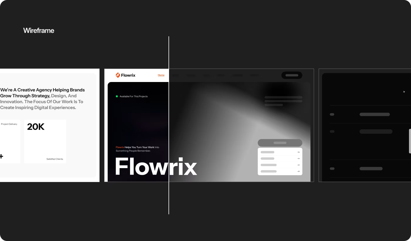
Layouts were reorganized so financial information could be scanned and understood more quickly.
A steadier visual system improved readability and helped the product feel more trustworthy.
We finished by tightening responsiveness, usability, and interaction clarity across devices.
Research
Research shaped how we simplified information, improved visual clarity, and organized the journey so visitors could move through the platform with less friction.
Services
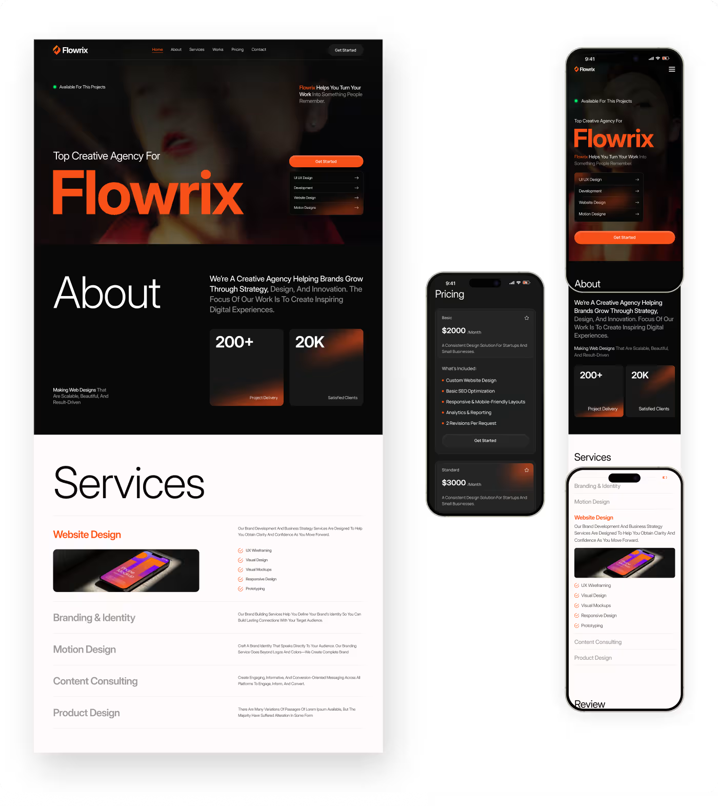
The site was redesigned so financial information feels easier to grasp and less overwhelming. Instead of dumping too much content at once, the structure guides visitors step by step with clearer sections and stronger hierarchy.
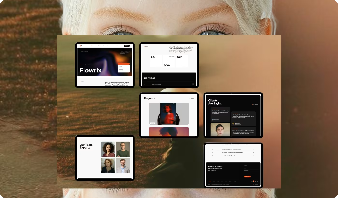
Homepage and feature areas were reorganized to explain the product more naturally—so people can understand what Flowrix offers without wading through dense blocks of text. Layouts and navigation were simplified for smoother browsing across the site.
Services
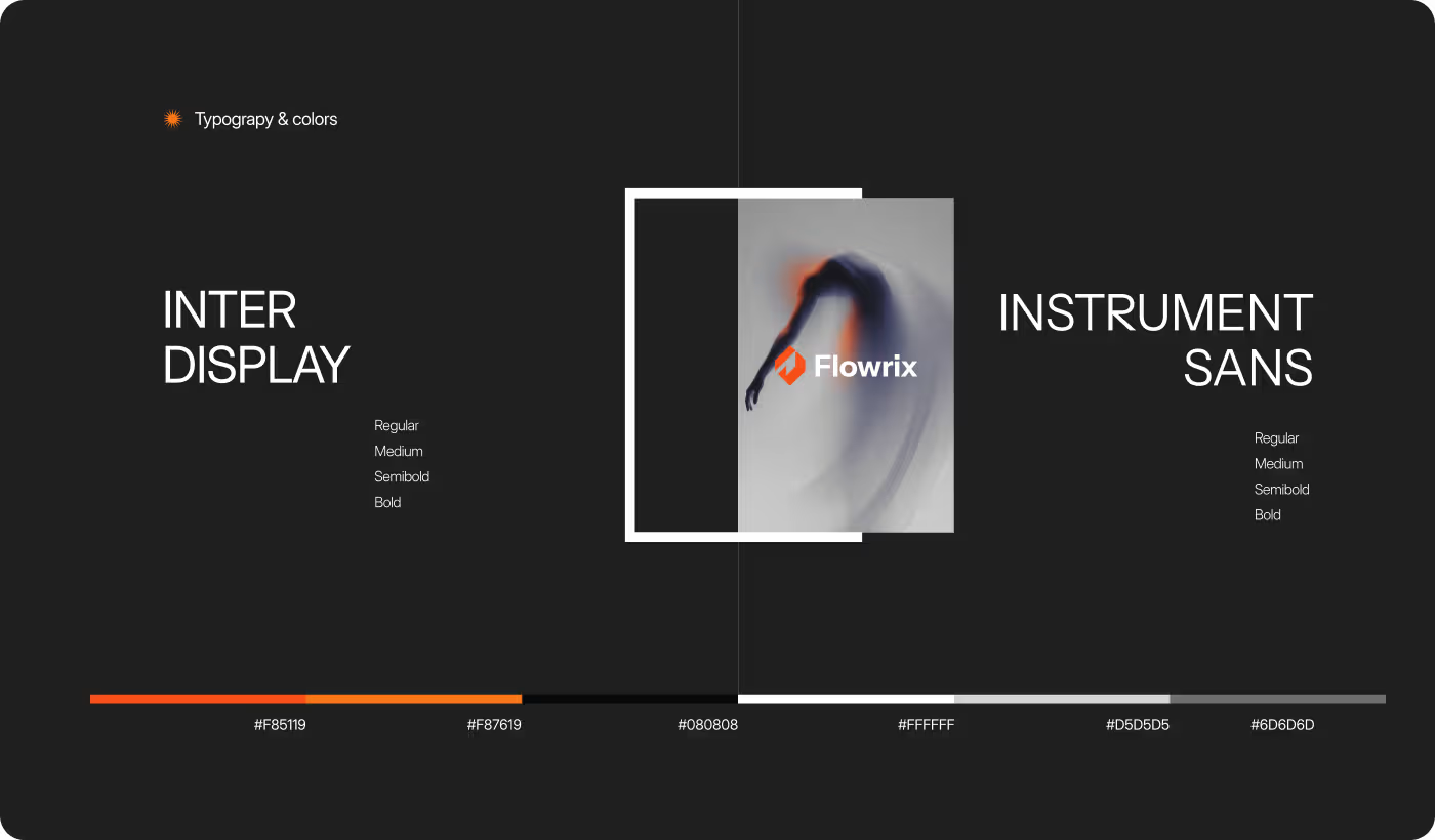
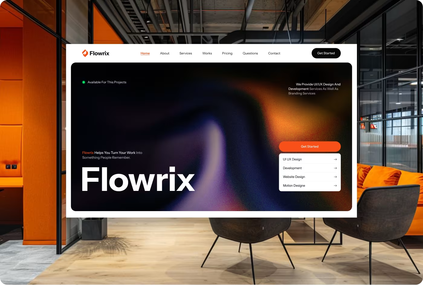
The interface was refined into a cleaner, more connected visual system. Shared typography, spacing, color, and components helped the site feel polished and reliable while improving readability throughout.
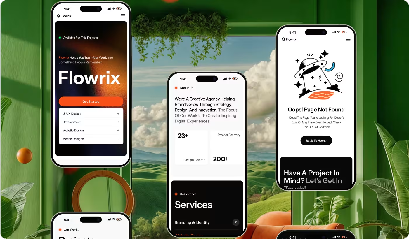
The darker visual direction and structured layouts were tuned to keep focus on key content and actions. Responsive screens were optimized so the same clarity and usability hold on desktop and mobile.
Results & Outcomes
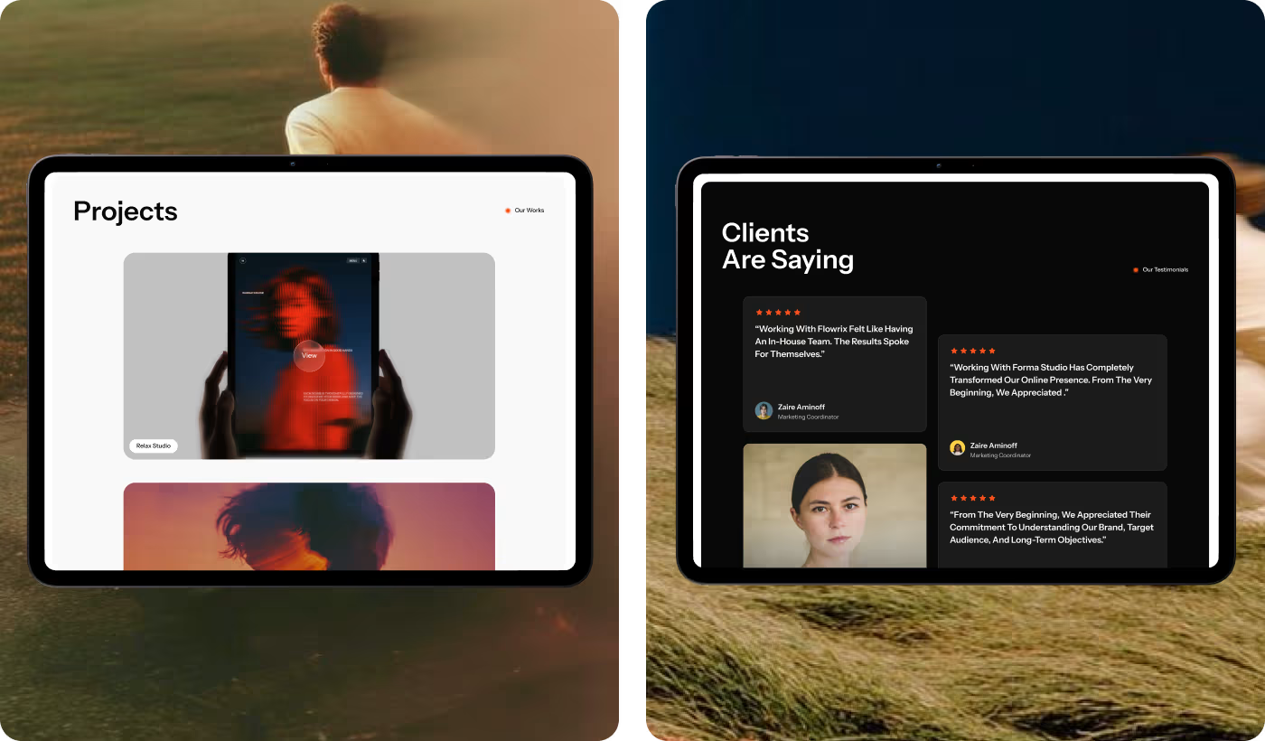
The redesign helped people understand the platform faster, browse financial information with more comfort, and interact with less confusion—while building a stronger sense of trust and consistency.
Tell Long Form Digital about your idea and we'll book a discovery call. After that, we'll send a clear proposal, and once approved, we get started.


