
The most useful web trends are not decoration. They change how quickly people understand a page, how confidently they interact, and how memorable the experience feels.
In 2026, strong websites combine expressive art direction with disciplined systems. The result feels distinctive without sacrificing speed, accessibility, or clarity.
Editorial Scale and Strong Hierarchy
Large type, deliberate contrast, and magazine-inspired composition are moving from campaign pages into everyday product and service websites.
The best examples use scale to guide attention. A bold headline works because supporting text, spacing, and actions remain quiet and easy to scan.
Motion With a Purpose
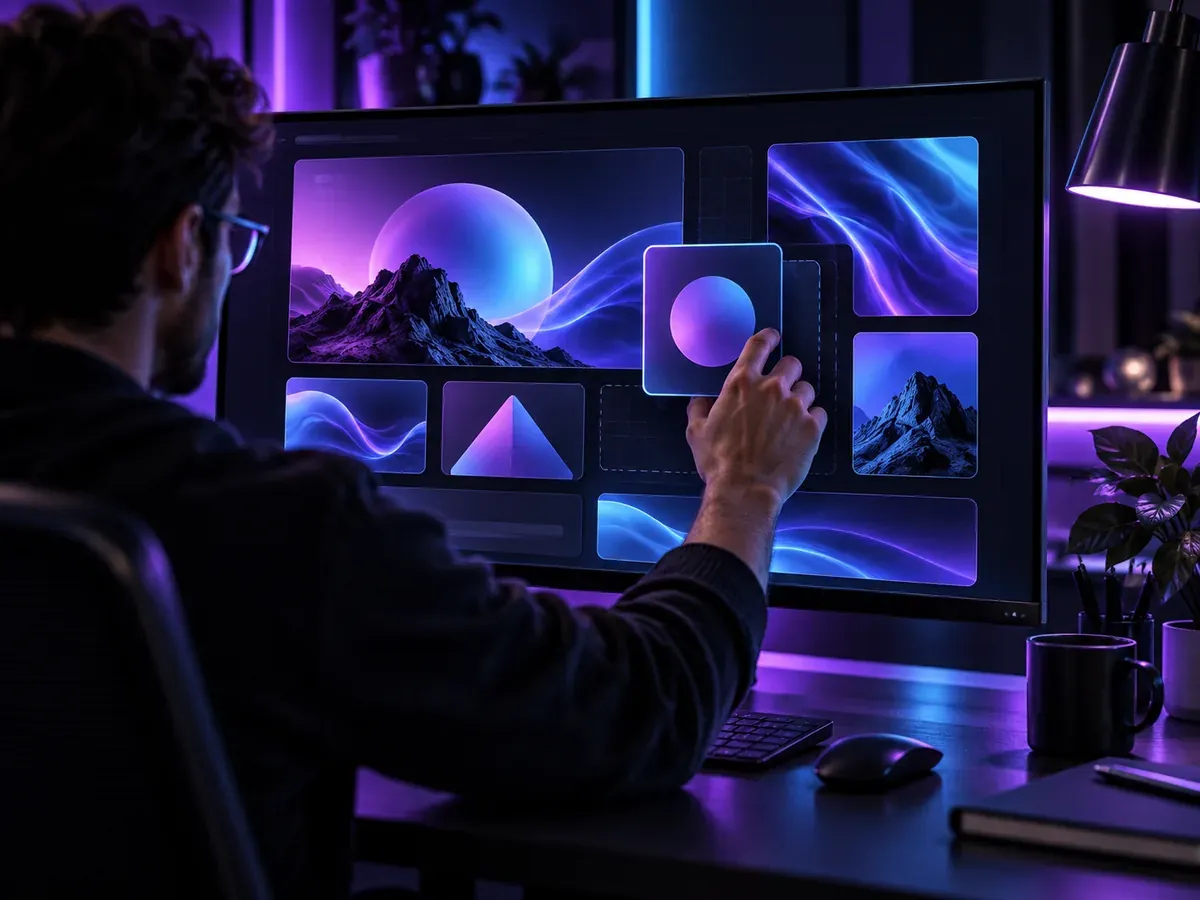
Motion is becoming part of the information architecture. Subtle transitions explain relationships, confirm actions, and help users maintain context as layouts change.
- Use motion to reveal cause and effect, not to delay access to content.
- Respect reduced-motion preferences and keep interaction feedback immediate.
- Design movement as a system so timing and easing remain consistent.
Flexible Visual Systems
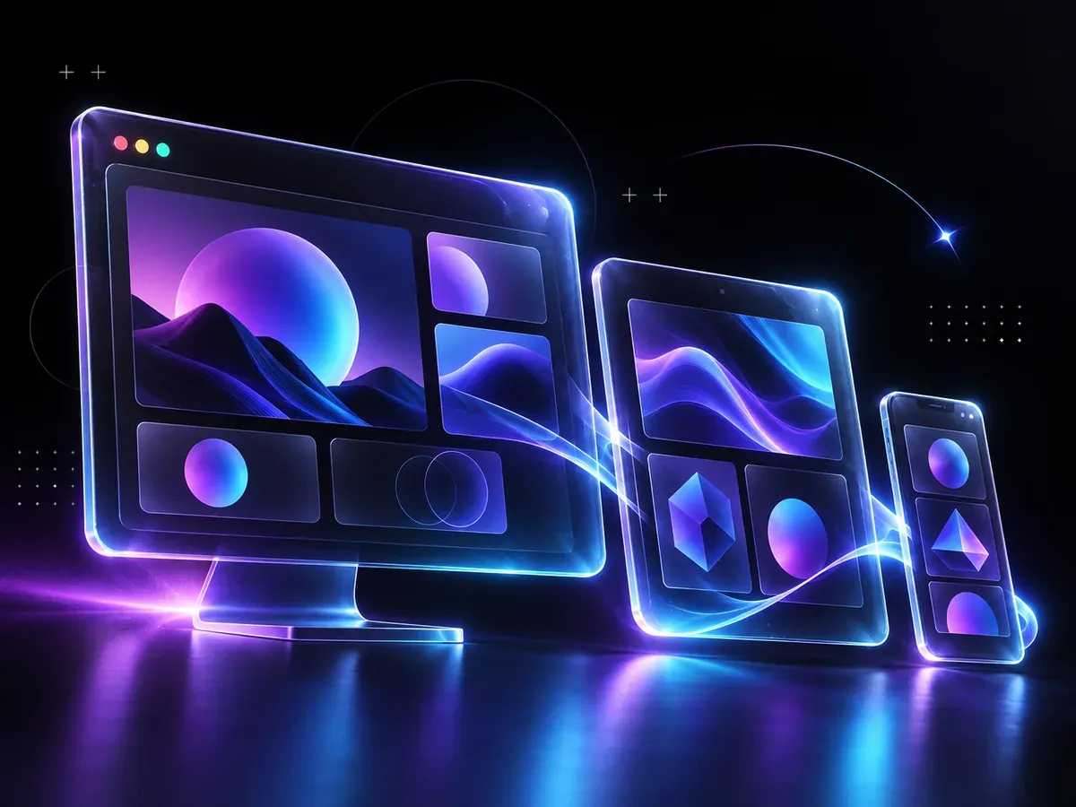
Fluid grids, modular cards, and responsive type scales let the same visual idea adapt naturally across devices.
The trend is less about making every screen identical and more about preserving hierarchy, rhythm, and brand character in every context.
“A future-facing interface is not the one with the most effects. It is the one whose system makes expressive design feel effortless.”
Long Form Digital Team
Choose Trends Strategically
Start with the audience and the job the page must do. Adopt a trend when it strengthens comprehension or brand distinction, and leave it out when it competes with the message.



Leave a Comment
Your email address will not be published.